Thursday, May 22, 2008

Painting the Petersons


A couple of weeks ago Holly called me and asked me if I could give her some advice about painting Benjamin's room. She had been chipping her fingernails scrapping off the wallpaper. I said sure why don't I come over on Monday and we'll paint his room for our next decorating mini-class. I don't think she knew what she was getting herself into. Well, after 2 week, 2 birthdays, 2 paint colors, 2 large blisters (from the 80 something screws Holly screwed in by hand putting up the shelves in the closet) and stencils, stencils, stencils, it turned out so stinking cute!


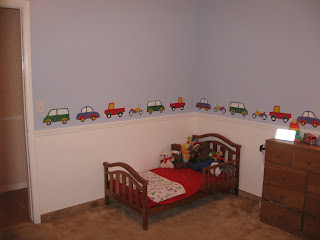
After Holly got all the wallpaper off we started painting. We choose nice pale blue for the top and a clean ultra white for the bottom with a chair rail about 32" up from the floor in the same color of white. These colors will grow with Benjamin. Since he loves cars and trucks we stenciled cars, trucks, vans, and motorcycles all the way around the room just above the chair rail. This made the room fun and colorful for him to enjoy while he is younger but can easily be painted over when he gets older.


The cars are painted in bright red, yellow, green and blue. We pulled these colors out of the fabric that Holly chose for a great topper over the window. We cleaned up the door and the closet doors by giving them a coat of the white paint and WOW! The room looks so amazing.


Even better than the way the room turned out was seeing the smiles on Holly and Benjamin's faces as the room started to take life. It's surprising how great giving a room a makeover can make you feel. I hope that you love the new room and I hope those blisters were worth it. Thank you for letting me be apart of this fun project.


Let me know what you think. Also, I love to hear about the projects that you are daring to dive into. Comment or email me.
Friday, May 9, 2008

Calming and Peaceful

Here is the project I just finished for LeAna. When I walked in and saw that her colors in her living room were blues I was so excited. Blue is my favorite color this year.

LeAna's style was very traditional and her furniture had lovely Queen Anne details. She had most everything that she needed. The room just needed a little face lift. I started by moving a few of the smaller pieces of furniture around to balance out the room more. Then I took items in the room that were special to them and showcased them. One of my favorite things was the piece of art that Bill (the handyman of the house) hung over the fire place. I hung pictures of her beautiful grandchildren and made a sitting area built around a rustic antique trunk that she had. She only needed a few pillows and accessories in the darker blue color which worked as the accent color in the room.

As we visited about the room LeAna mentioned that she loved mirrors and I immediately had the vision in my head of an arrangement of mirrors on the wall as you come up her stairs. It took a lot of work to make that happen but I knew that it would be amazing and I refused to let it go. Thank you to her daughters who payed for the mirrors for her mothers day gift.

This wall of mirrors is my new favorite thing.
I forget some times how much I love my work. I enjoy so much, the people that I work with and it is the best when they get involved in the transformation of their home. The finished project results in them feeling the same sense of accomplishment and pride that I do. It really is a lot of fun for me and I want to thank everyone who has had me do work for them.


I hope that everyone catches the decorating bug from looking at my blog. If anyone has any questions for me just leave a comment or email me.


Happy Decorating.

So many picture you don't know what to do.


Do you have a lot of pictures and you're not sure what to do with them? Here is a great way to display them. This first picture is in the living room of my photographer friend Carma Gray so of course she had plenty of beautiful pictures to work with. There are 4 things to remember. First, keep your pictures close but not to close. (1-3 inches.) Second, try not to line up any frame with another frame in the grouping. When you have a lot of picture it might happen but try to avoid it. Third, be consistent with the finish on your frames, all the same, 3 or 4 different finishes or completely random. Fourth, start with a picture in the middle and build out.
The second picture shows how this crazy picture arrangement has helped to disguise some unsightly switches, thermostat, and a door bell.

Tuesday, May 6, 2008

What's comming up.

I have been working on a project that I will finish up on Saturday and of course I didn't take before picture but I took in the middle pictures and on Saturday I'll take some after pics and show you how it turned out. It is going to look really nice.

Some time around May 20th we will be having another Enrichment mini class. This class will focus on painting. I am helping Holly paint and decorate little Benjamin's room. It is going to be really fun. I hope a lot of people are able to come. I'll post the exact day and time when I know.

Thursday, May 1, 2008

Pictures to high?

A couple of pictures to show how nice it will look if you bring your pictures down to meet your sofa.


When you are hanging pictures above your sofa you should not have more than 12 inches between the top of your sofa and the bottom of your frame(s). The reason... having your pictures close enough to the sofa gives them a relationship. The sofa, pictures and anything else nearby will become a grouping that is pleasing to the eye. If your pictures are to high then they seem to be floating in space. Your eye should be able to move easily around your room. This is a very common mistake.
I promise if you try it , it will feel good. When all is said and done, your home should be a place that makes you feel good. Good Luck! let me know how it works out.